29 Sep The Braunschweig Project: A 1920’s Tulsa Bathroom Remodel
The Braunschweig Project: A 1920’s Tulsa Bathroom Remodel
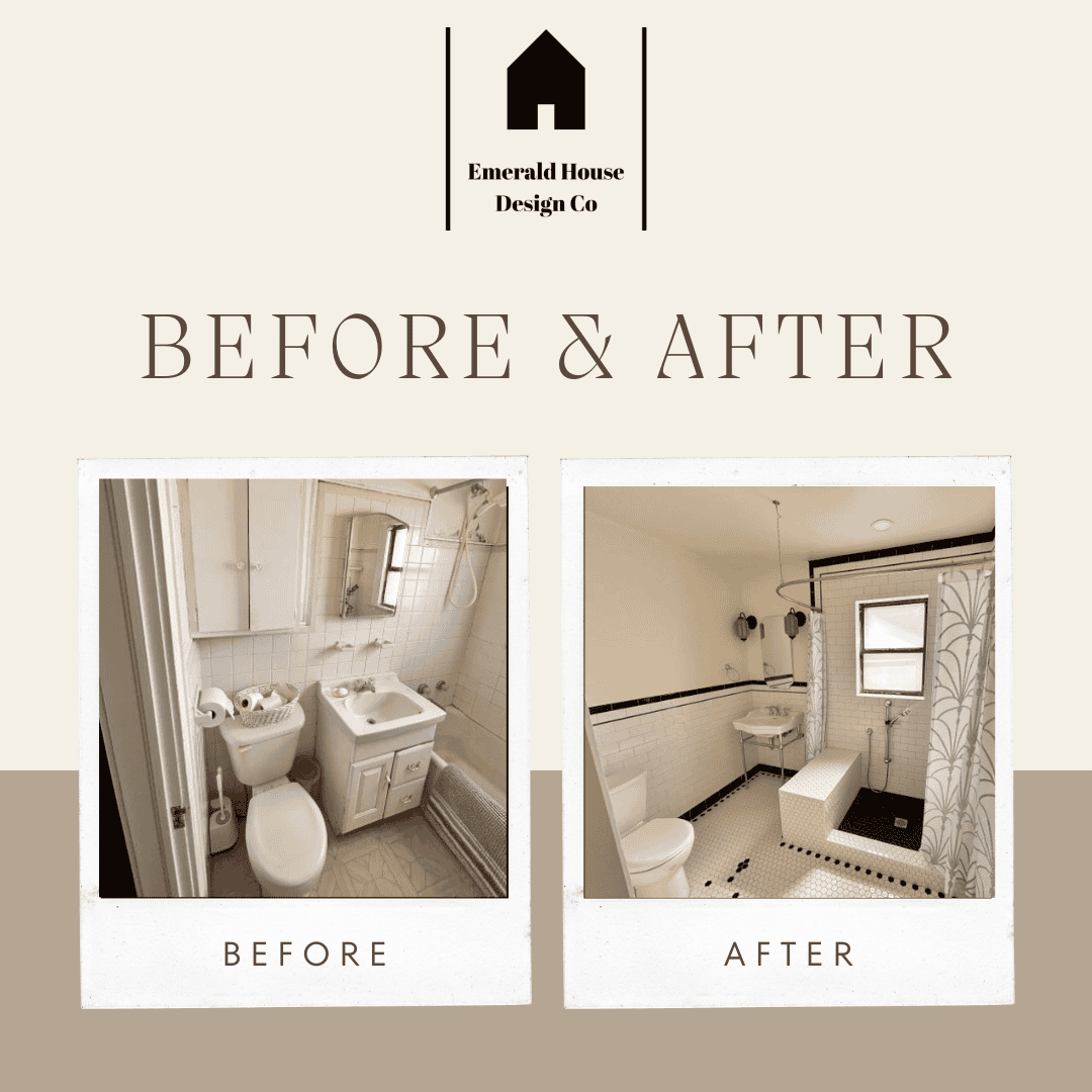
The remodeling project for the Braunschweig’s 1920’s bathroom was all about making the space larger. This home is in the midtown / downtown area of Tulsa and was built in the 1920s. The owners wanted to marry the character of their older home with a more functional layout and a more modern design. The existing bathroom was dated and cramped and not very functional at all. We were able to use the most of the space they had to make the bathroom more functional, while also bringing in some modern elements, and some of that character. Read on to see how we turned this cramped 1920’s bathroom in the Braunschweig home, to an updated, functional, and spacious bathroom, with touches of character throughout.
The Goal for the Braunschweig Bathroom Remodel
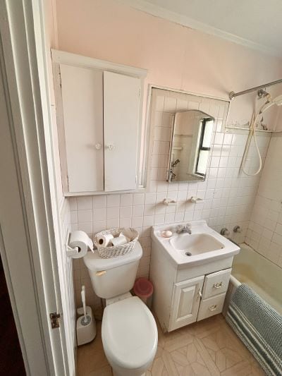
The bathroom in the Braunschweig’s home is the only bathroom in the home. Not only is it the only bathroom in the home, its existing footprint was small. The goal was to increase the flow and functionality of the space. It was also to update it to a more modern design while keeping some of the character from the 1920’s home. A more functional and spacious bathroom is much easier to relax in after a long day’s work when you’re not cramped.
Here’s What We Did With This Project
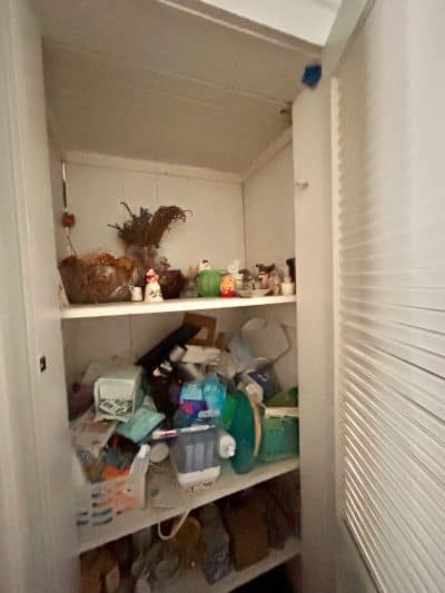
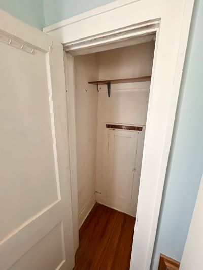
The first problem at hand was that to be able to truly enlarge the space we needed a larger bathroom footprint than the existing one. We extended the space by utilizing the the closets on the other side of the wall. We tore down the wall in between. This helped gain some crucial space we needed. It allowed for the bathroom layout to have a more open feel. We also moved the locations of the sink, toilet, and shower to give a more functional layout in the newly expanded space. To also help keep the space feeling larger, we converted the swinging entrance door to a barn door.
New Locations
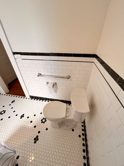
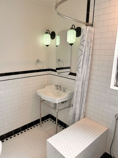
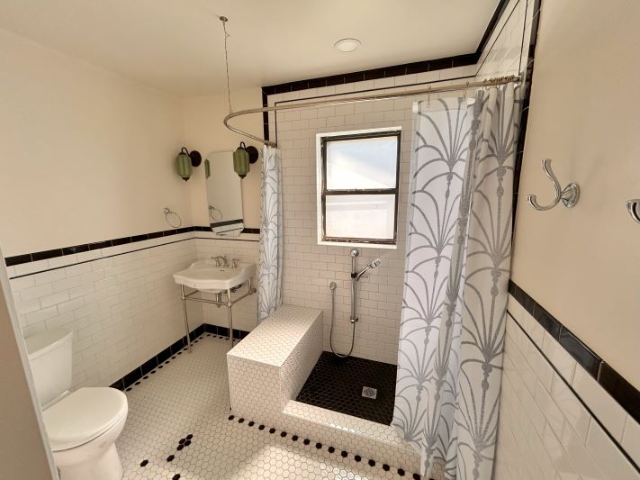
The first step to rearranging the bathroom was to flip the shower head. Reversing the shower head from the left to the right wall allowed us to extend the space beyond the shower to the left. That area is where the new white pedestal sink and medicine cabinet were relocated to. With that wall of the bathroom having been extended, that allowed us to push the toilet back and gain some extra much needed floor space.
The Shower Enclosure
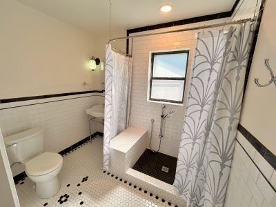
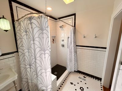
The homeowner chose to not have a glass shower door enclosure. Because of this, we were able to create a more open feel with the shower by incorporating a curved shower curtain rode which allowed the shower curtain to be moved. This helped to give a more open concept when the shower was not in use. This also helped incorporate some of the older 1920’s feel that we wanted to continue to tie in.
The Tile Shower & Flooring
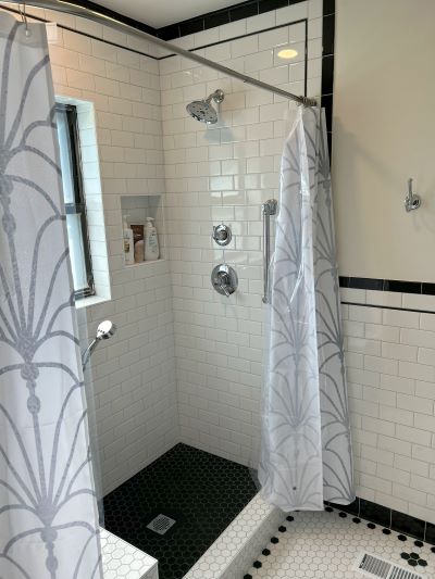
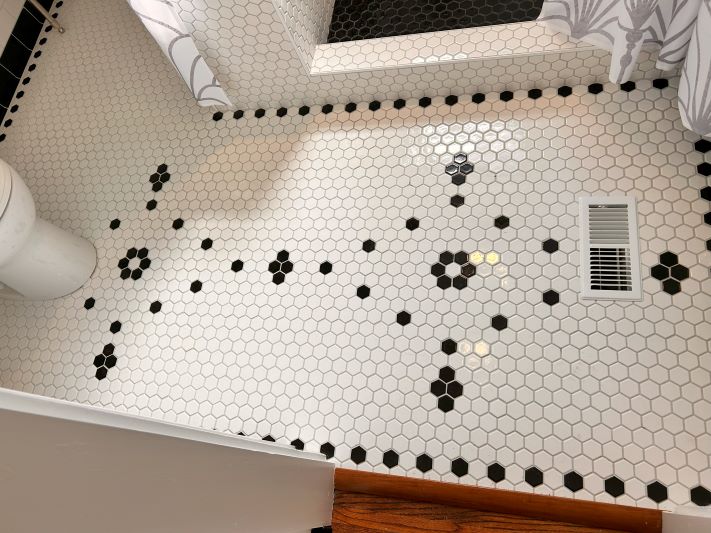
We wanted to incorporate black and white tile design as a nod to the age of the home. However, we wanted to update this to a more modern feel, so we went with a hexagon tile. This added some fun texture to the room! Also, to keep the space feeling as open as we could, we went with a mostly white tile with touches of black accent tiles around the room. The floor was kept to a hexagon shape, and on the walls we used a 3×6 subway tile, including in the wainscoting around the wall. The white hexagon floor tile was added with a custom black dot pattern. We also continued the hexagon tile into the shower, on the bench, and the shower floor.
The Accents & Finishing Touches
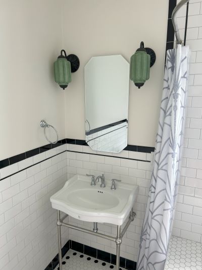
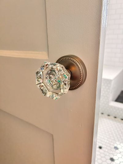
We used a variety of accents throughout the bathroom to provide touches of character that would help blend the old and the new. The barn door was given a beautiful glass door knob. The sconce lights on either side of the medicine cabinet helped to add a touch of flare while also providing some much needed lighting in the corner over the pedestal sink. Together from the door knob to the tile and the lighting, we were able to take a cramped and outdated bathroom- and bring it new life! The bathroom is relaxing, open, and clean while still giving that 1920’s nostalgic feel.
A Bathroom Transformation

The Braunschweig project started out as a cramped bathroom in the midtown / downtown area of Tulsa. But with some rearranging and expansion, we were able to increase the footprint of the bathroom to make it feel more luxurious and spacious. Throughout the whole project we blended modern design and that old world charm, perfectly blending the two. Now, the bathroom is a spacious and relaxing place to practice self care and unwind.

Sorry, the comment form is closed at this time.